Cardiff University — Together in progress
Logo refinement: Rob Clarke
Photography: Christian Sinibaldi
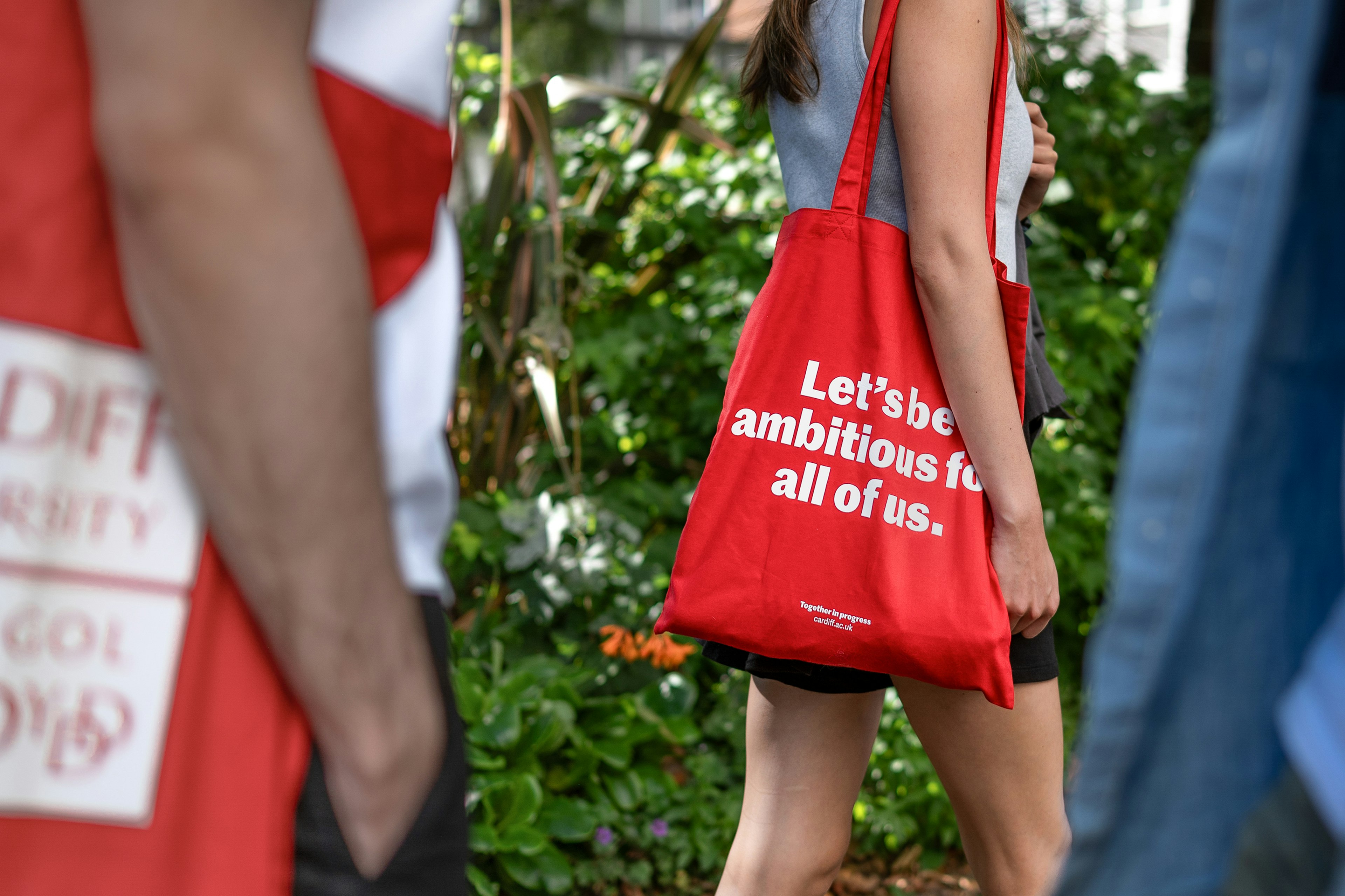
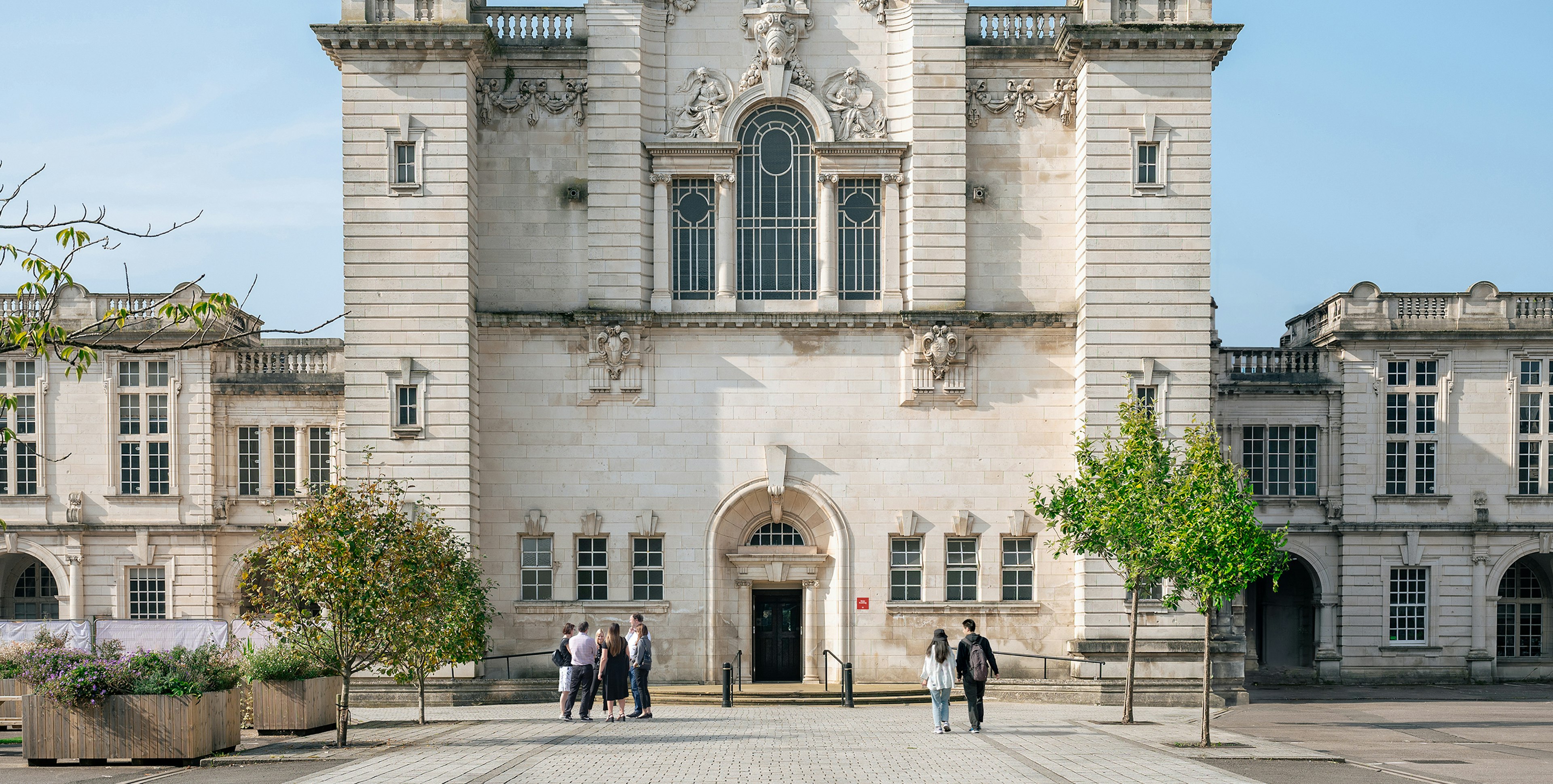
The highest-ranked in Wales, Cardiff University has been a beacon of progress for more than 100 years. We united the organisation behind a single shared ambition: a better future for all.
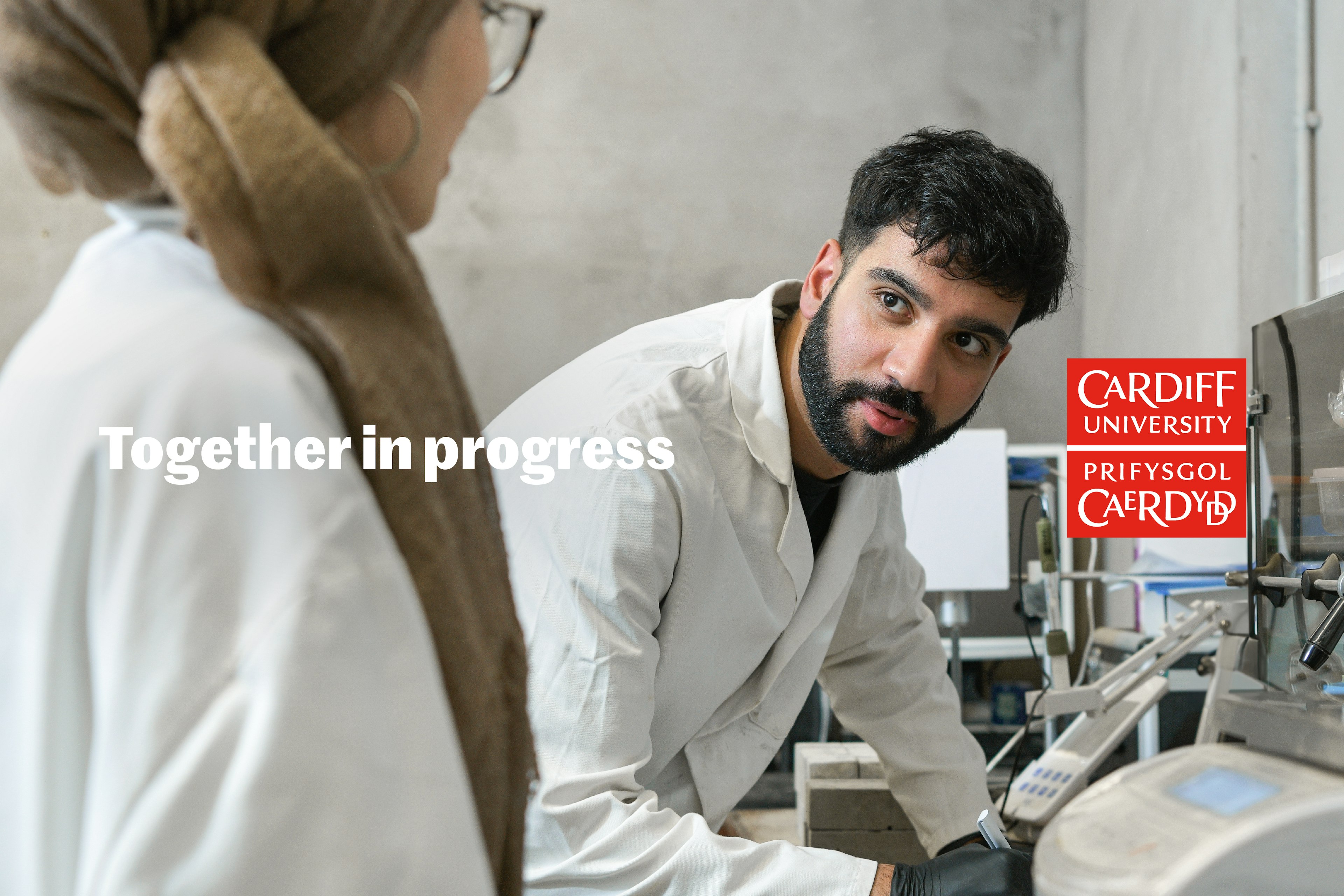
Where other institutions promise individual success, Cardiff invites students to join a collaborative community of thinkers and doers making significant strides towards universal progress.
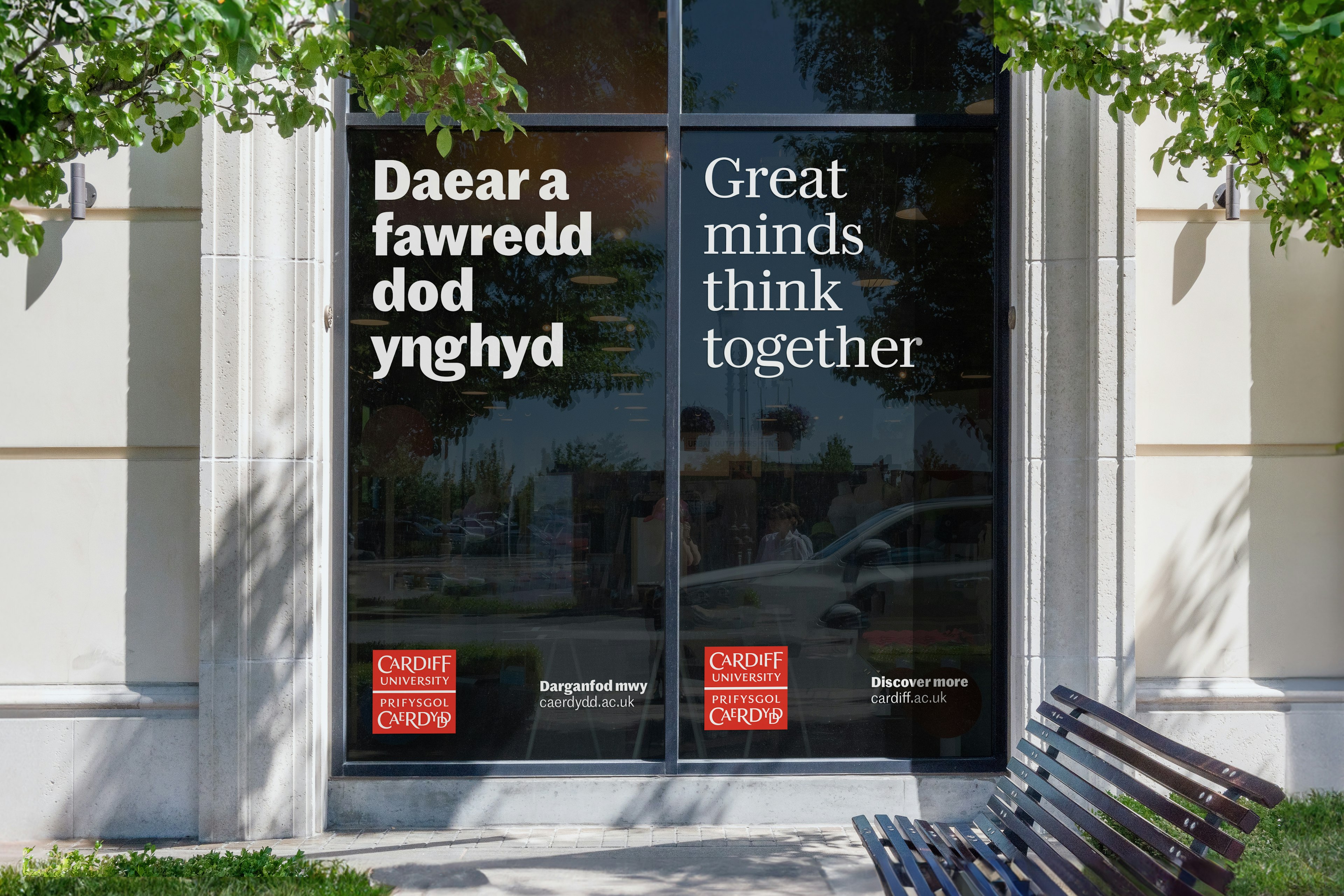
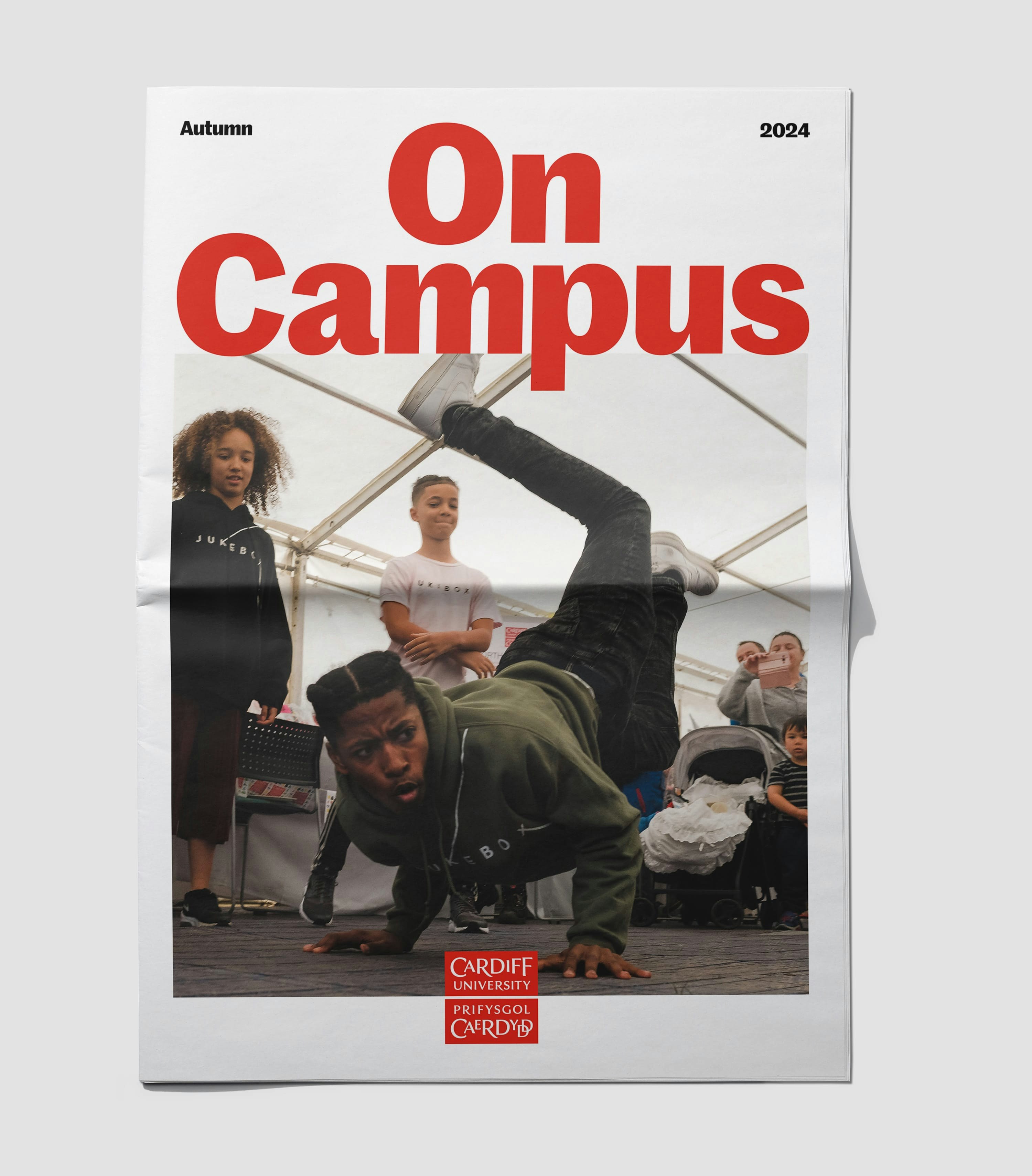
To celebrate the University’s proud Welsh heritage and make bilingual applications more readable, we worked with Commercial Type to develop a series of glyphs unique to the language.
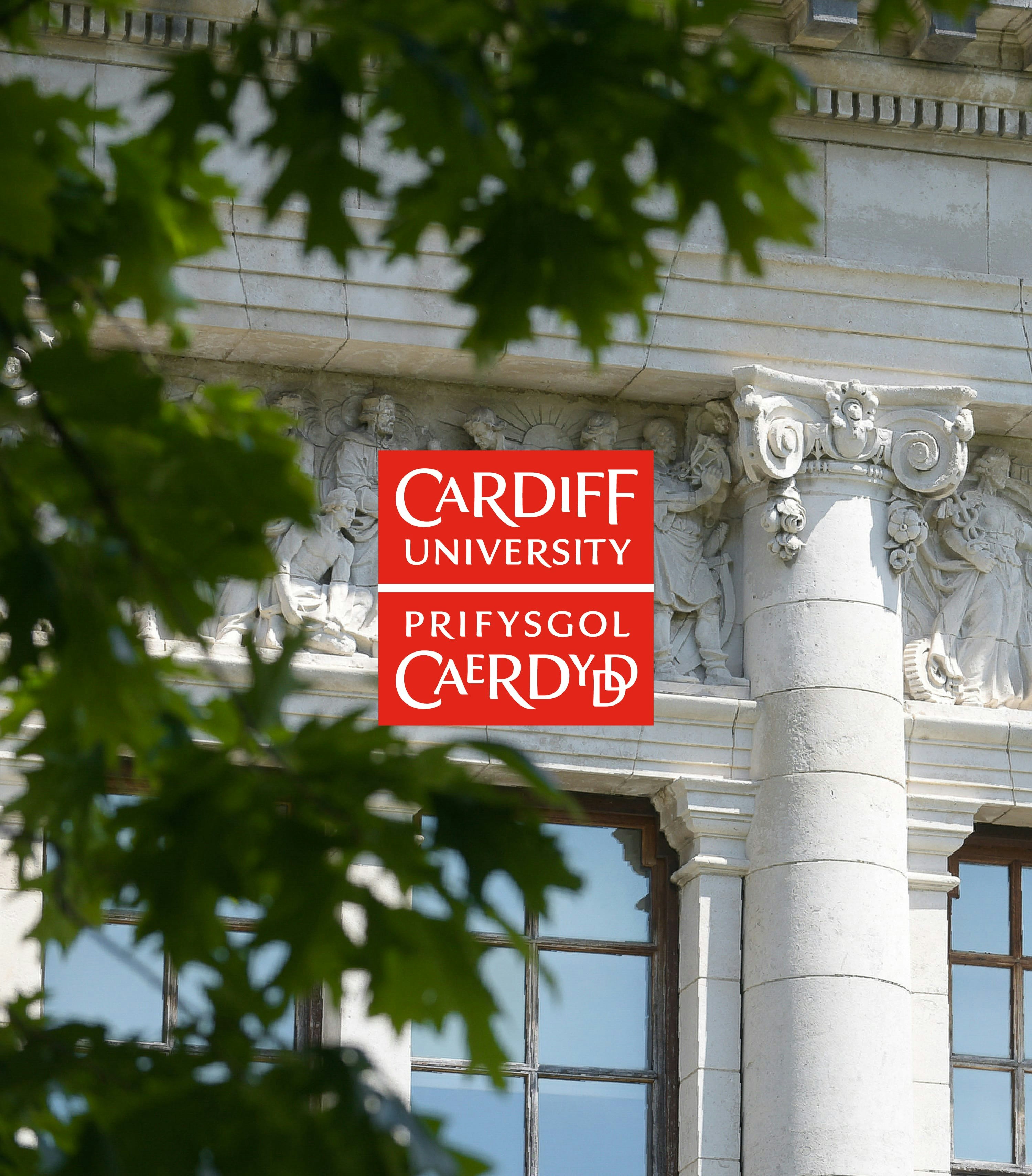
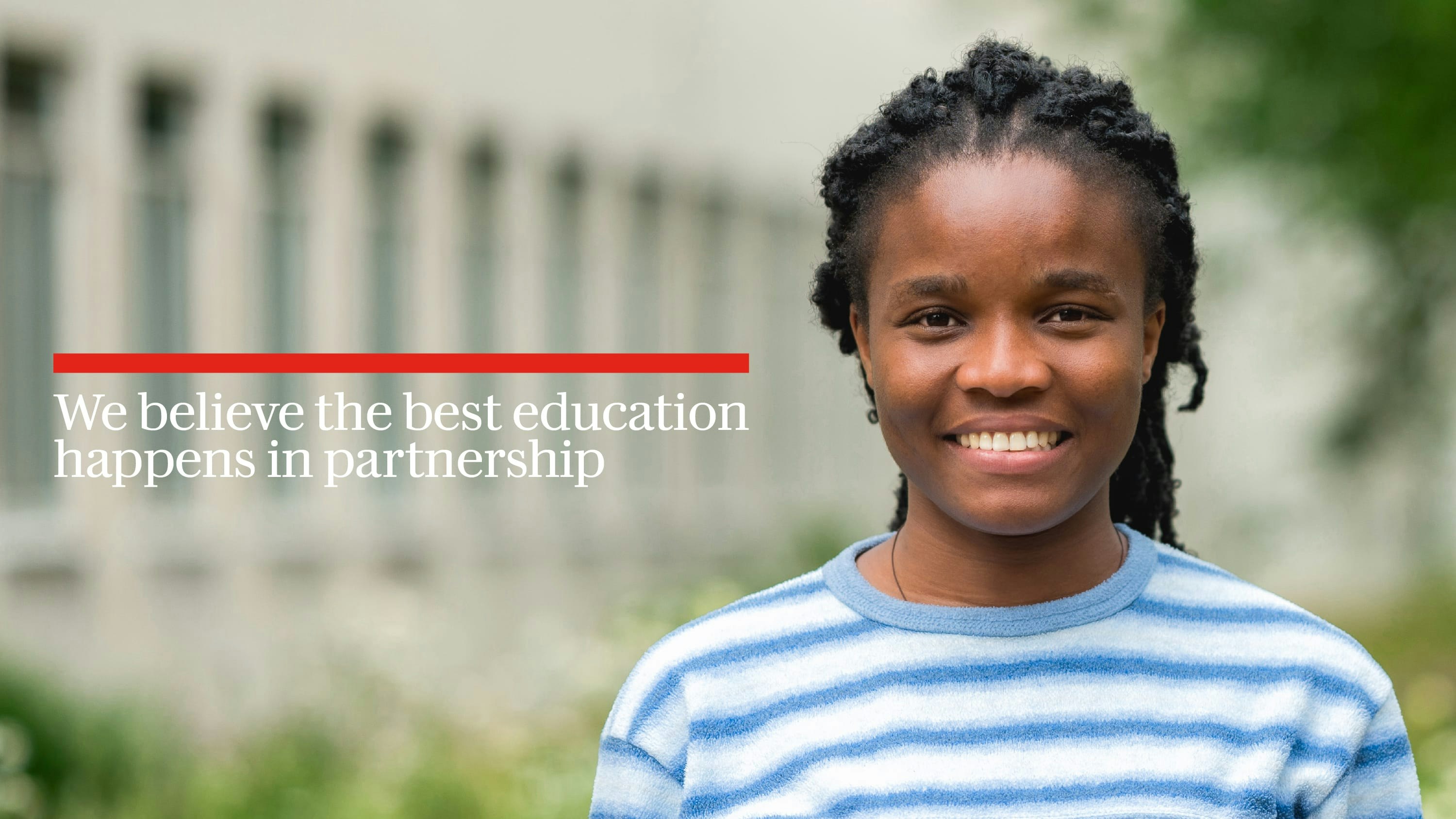
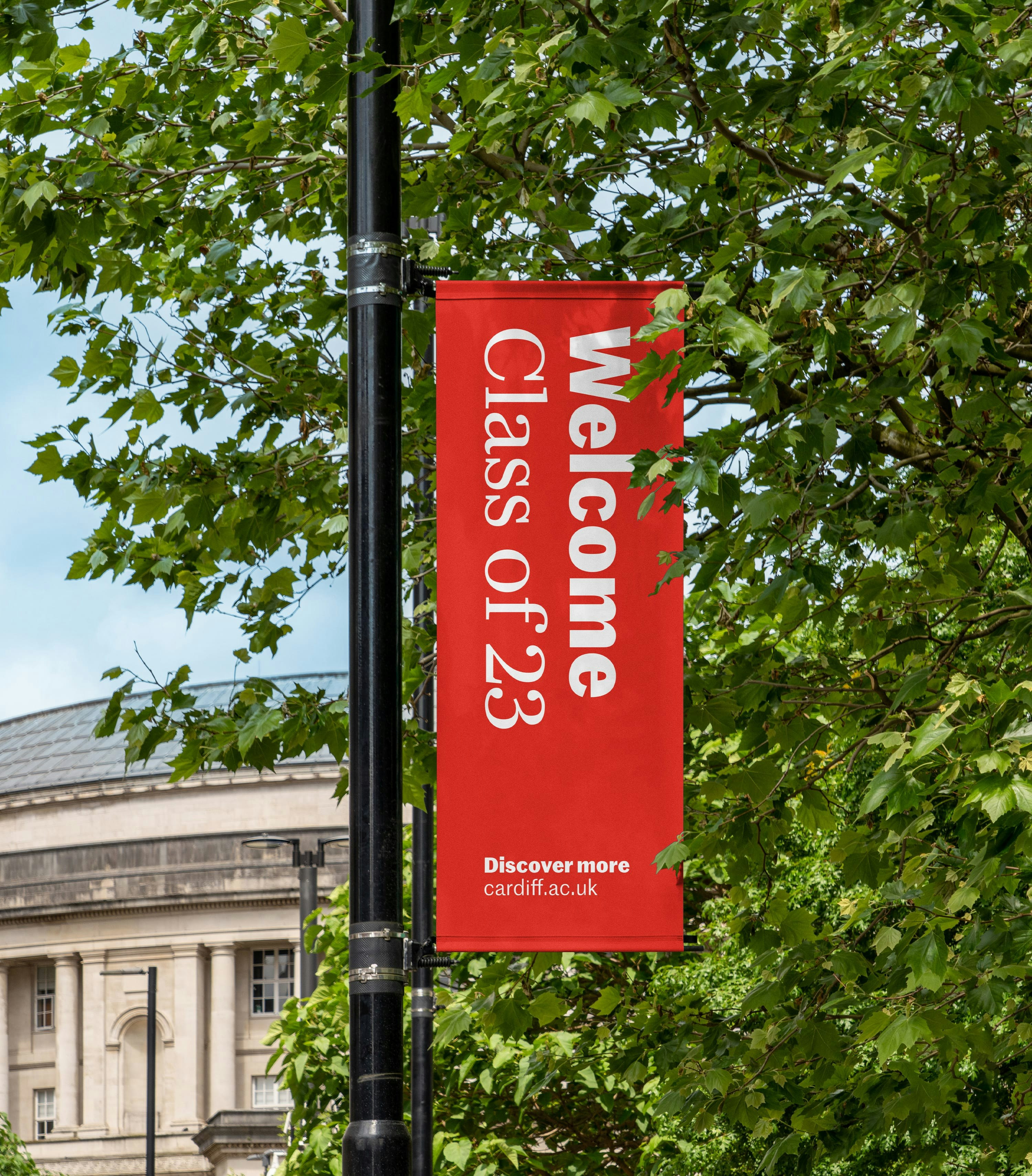
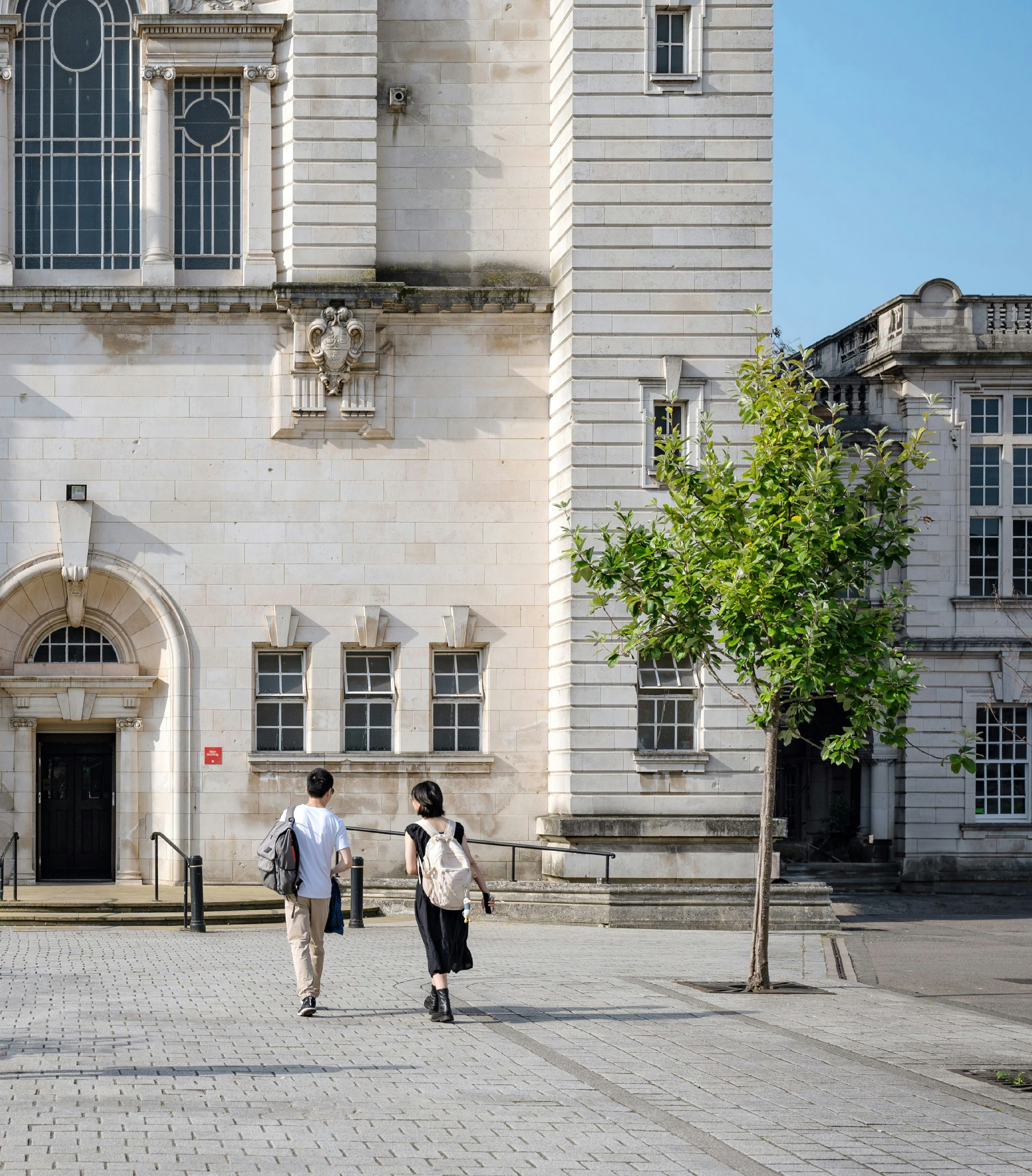
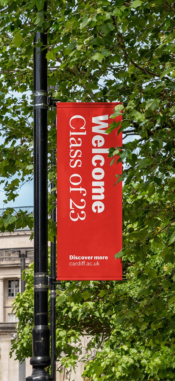
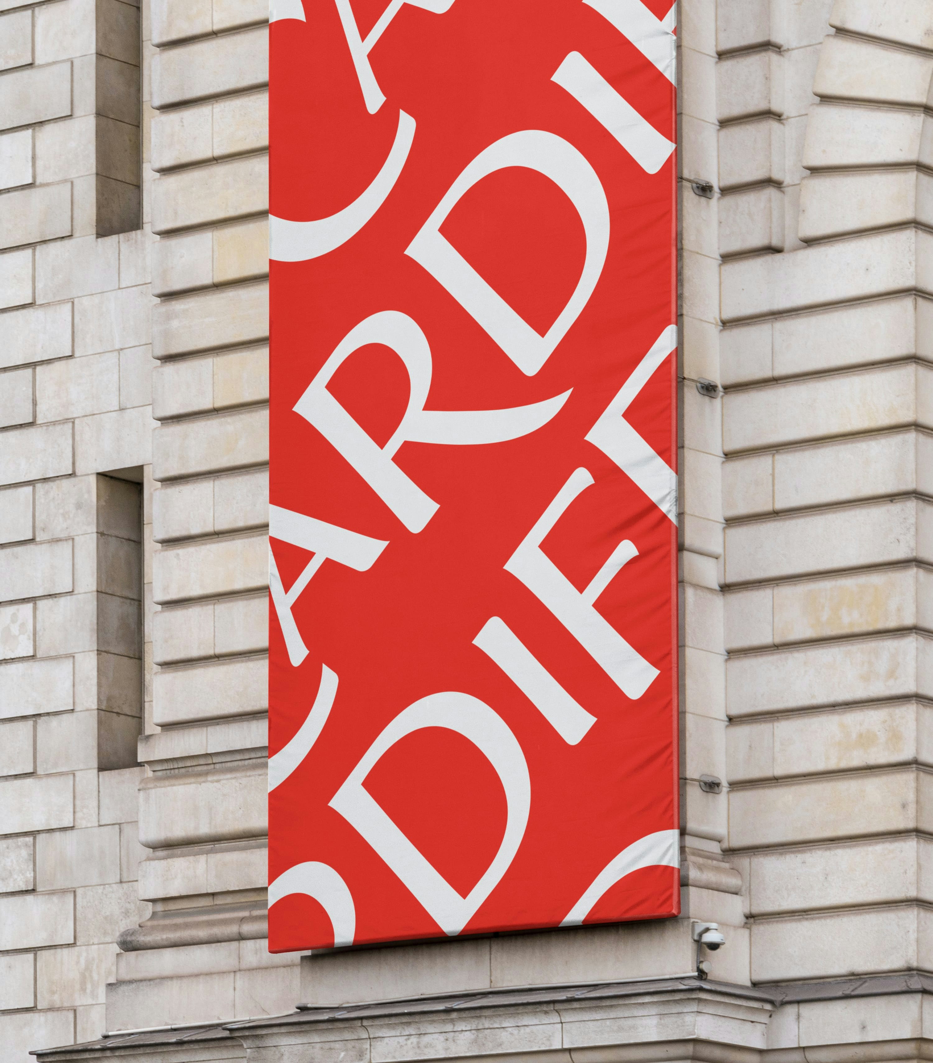
A new type pairing leads the refreshed visual identity. Darby’s simple serifs hint at the university’s heritage whilst Marr Sans positions them at the forefront of discovery.
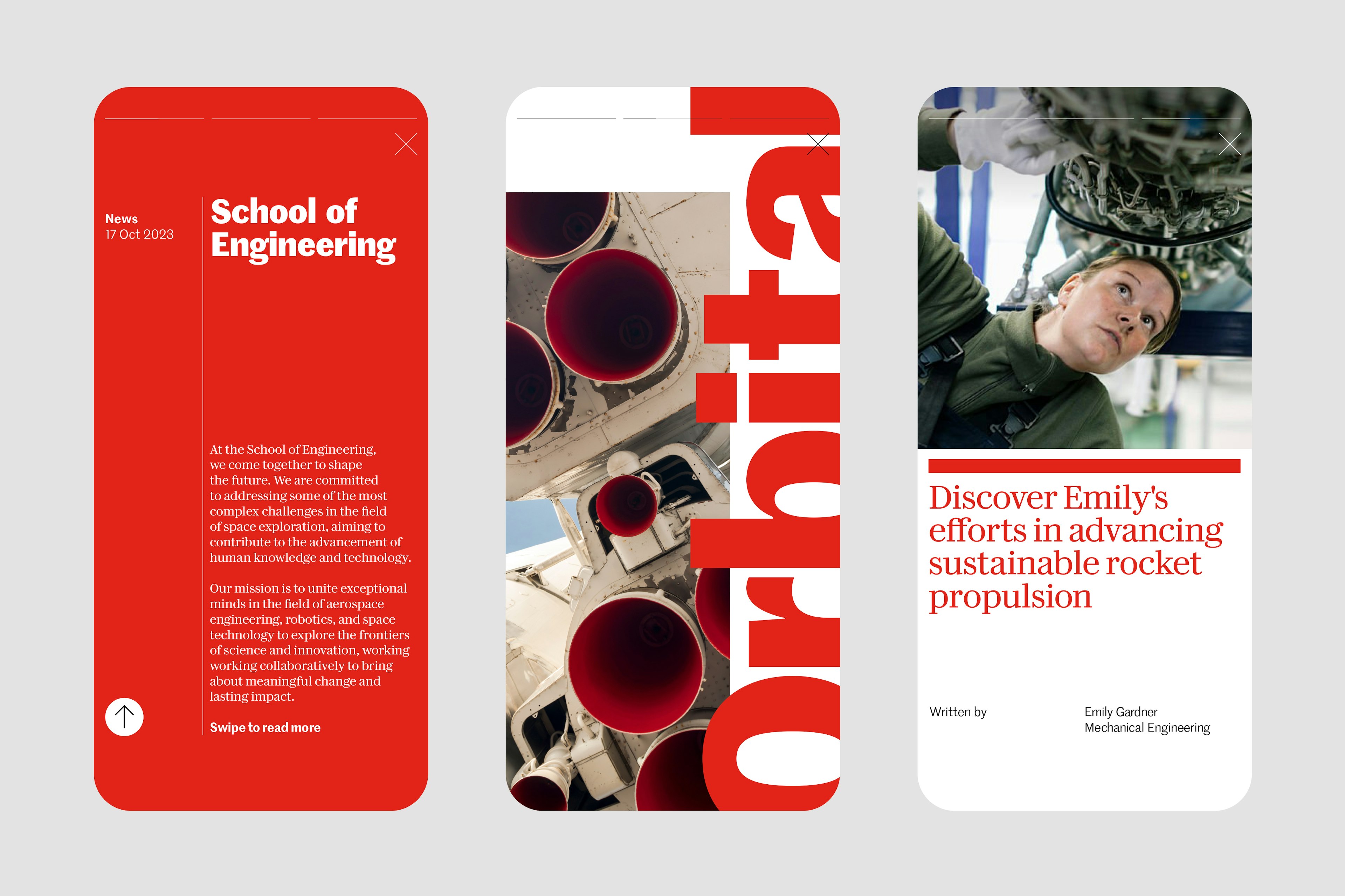
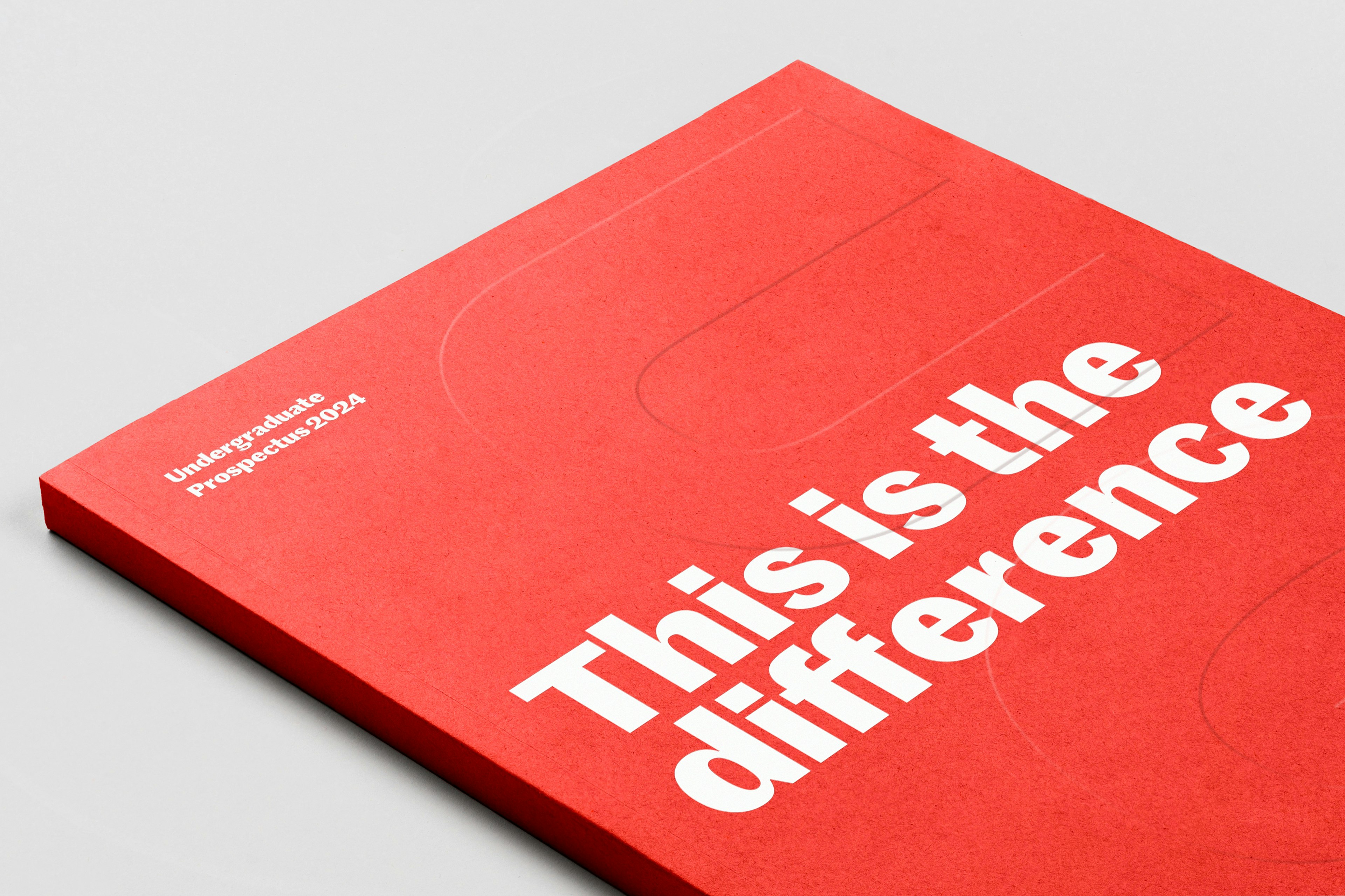
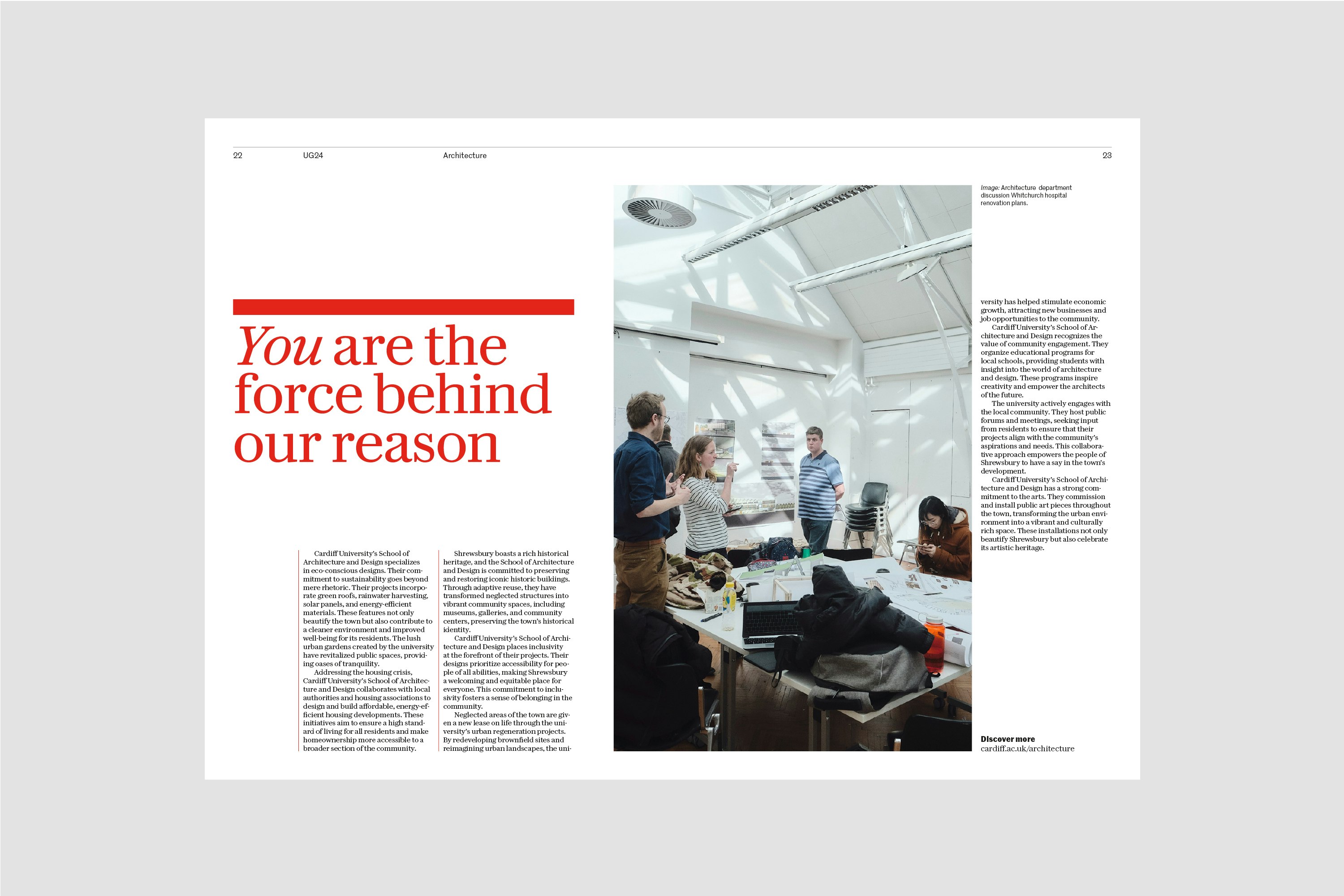
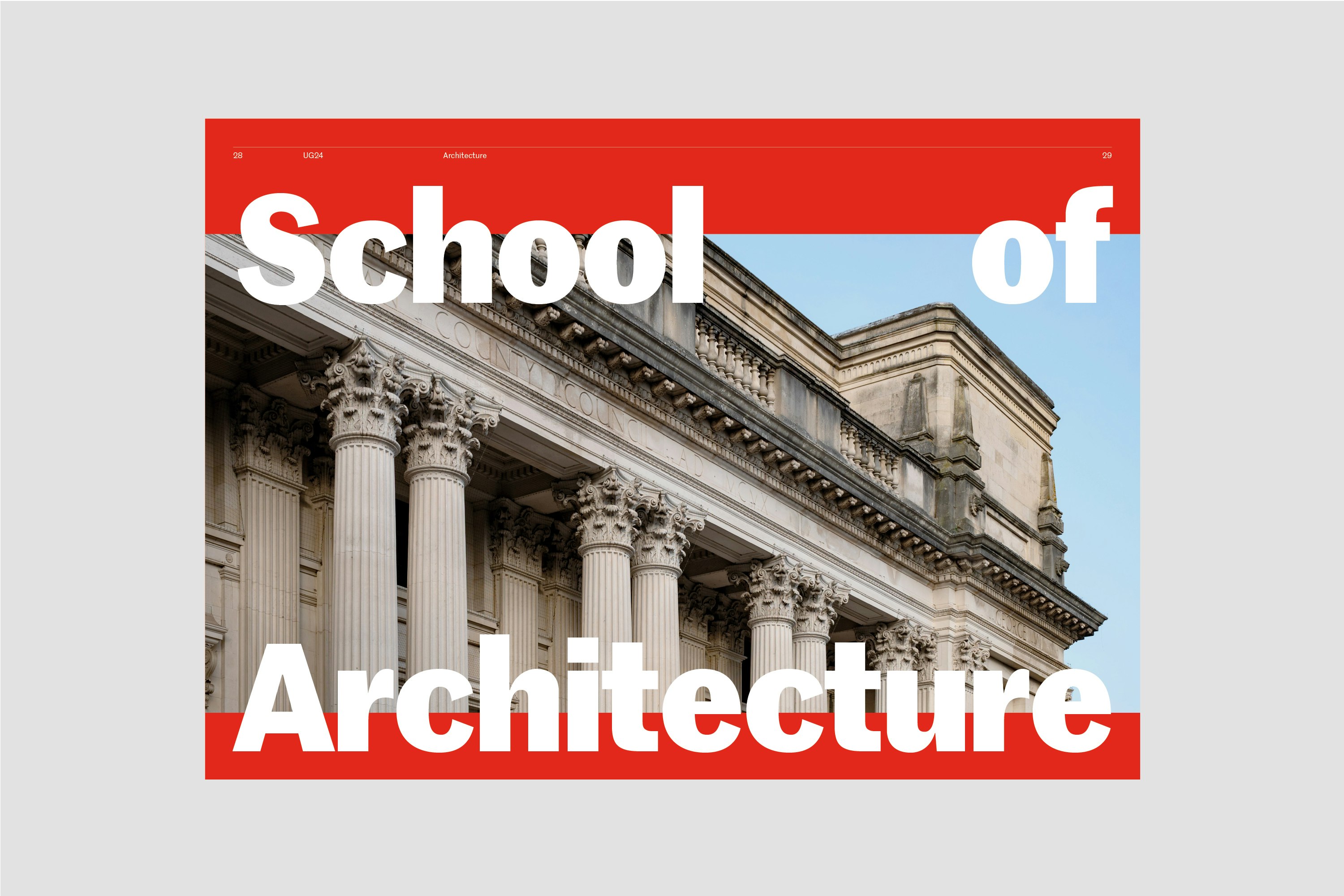
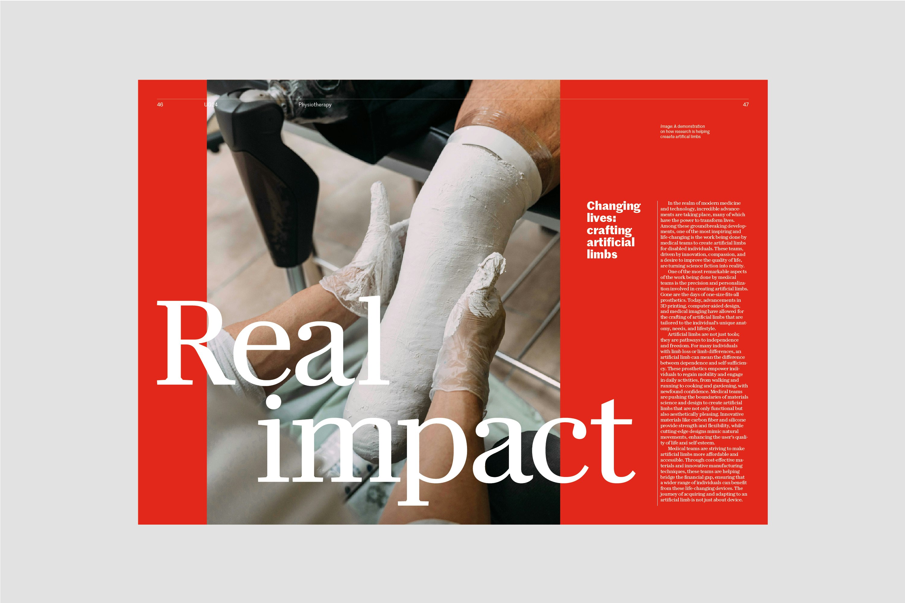
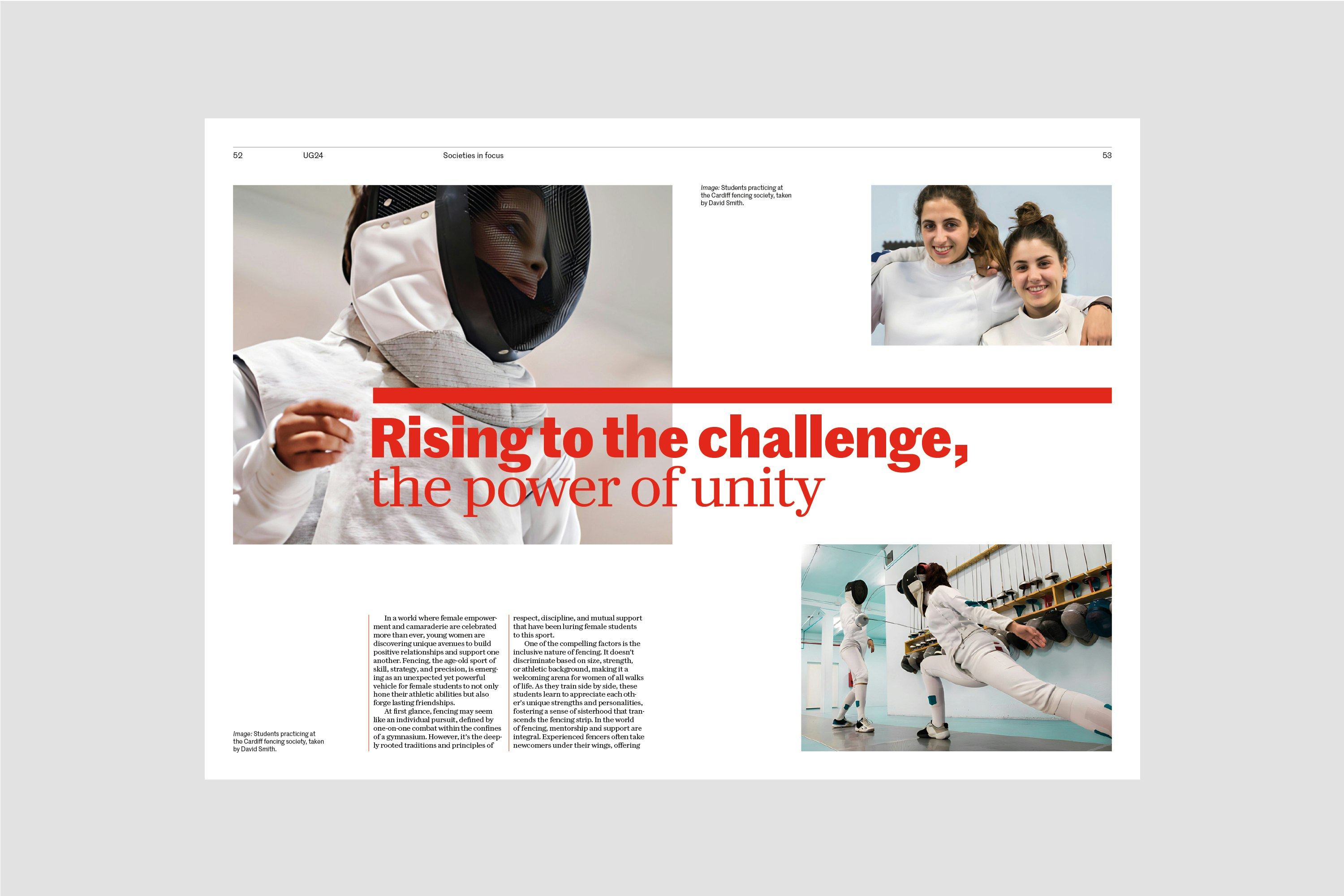
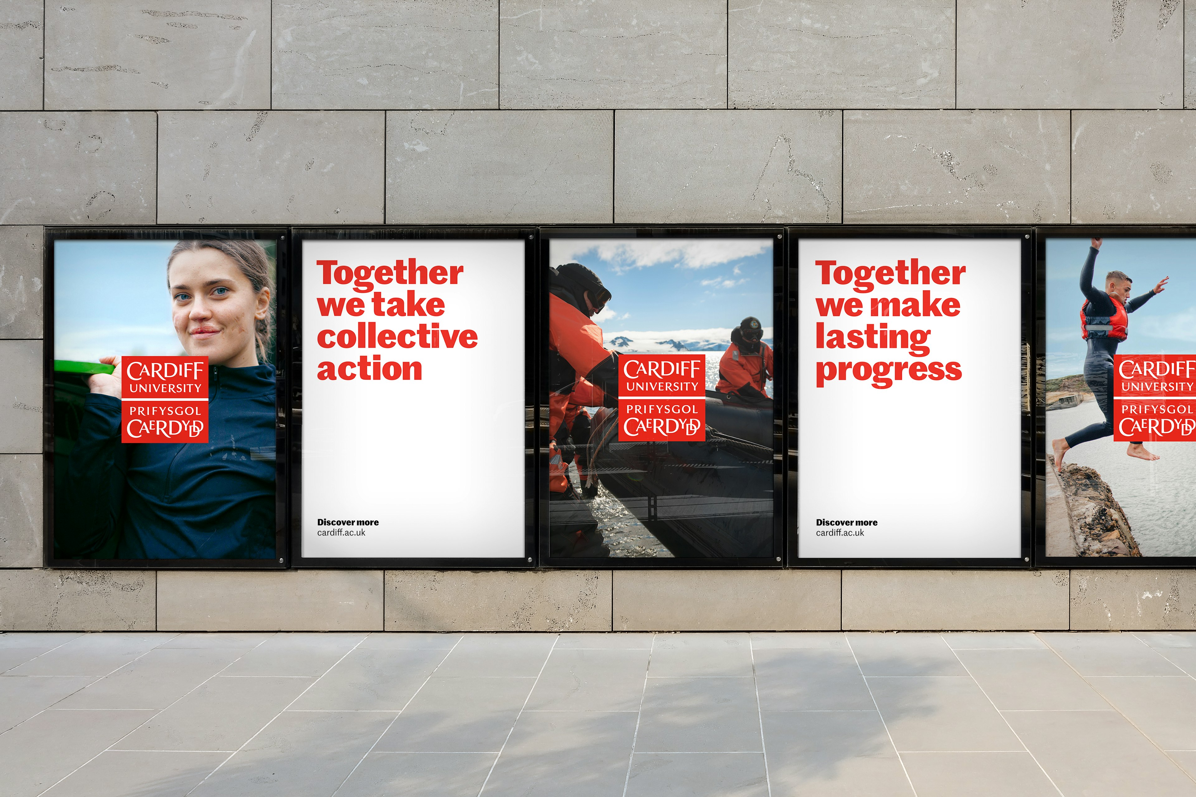
A simple, flexible visual language enables the University’s various teams to introduce the new approach gradually and at scale.
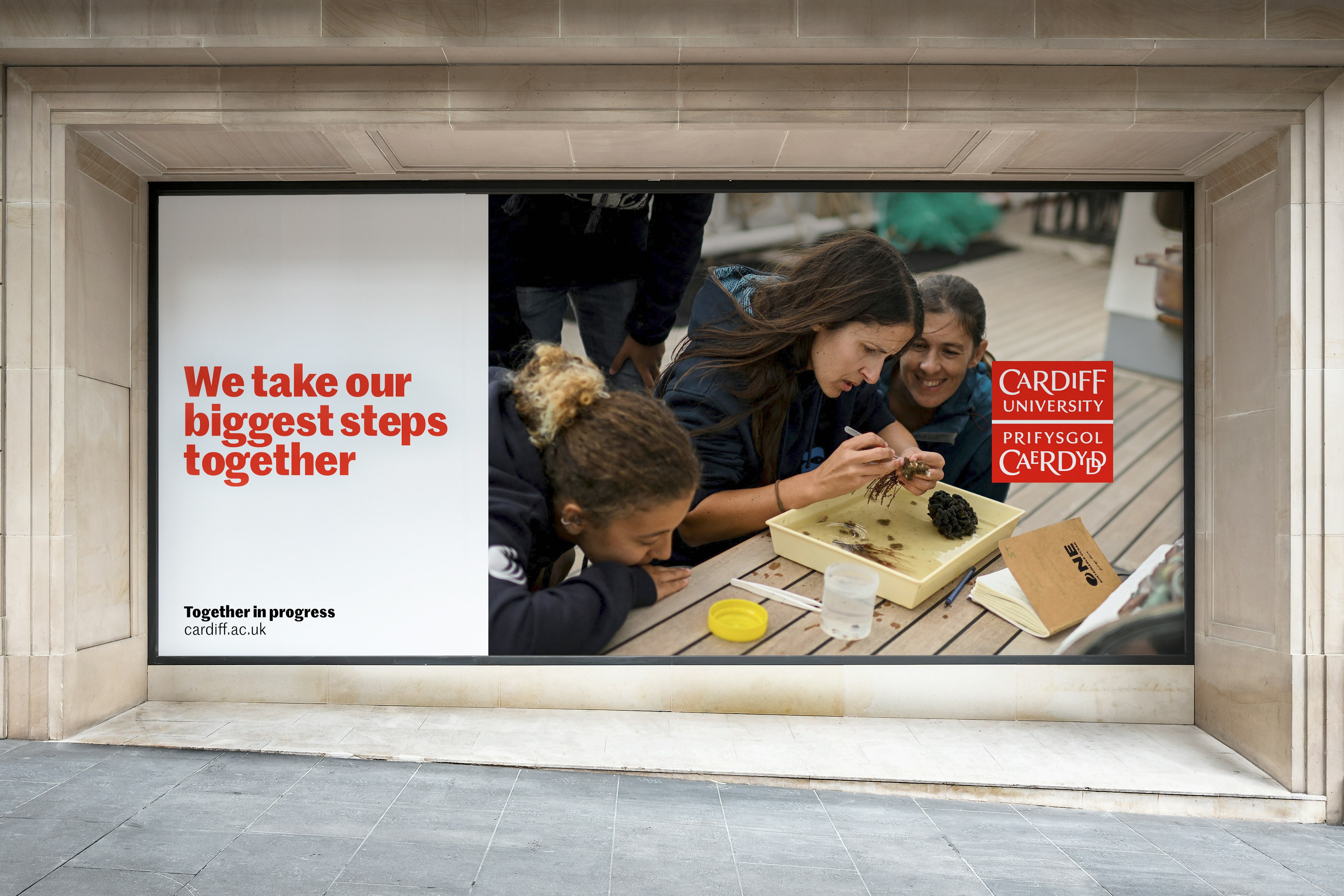
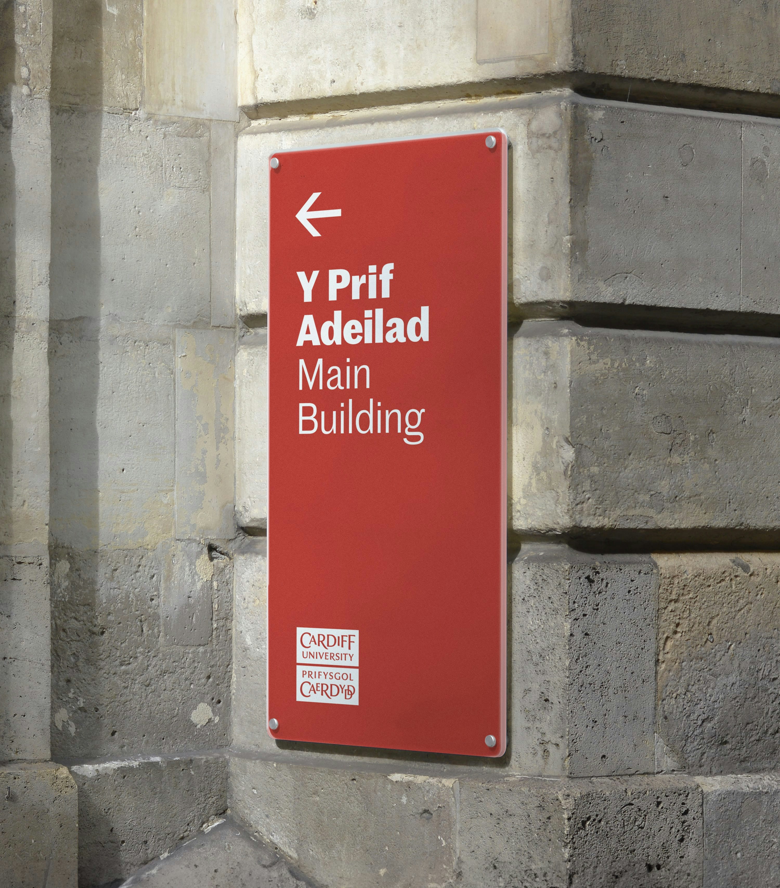
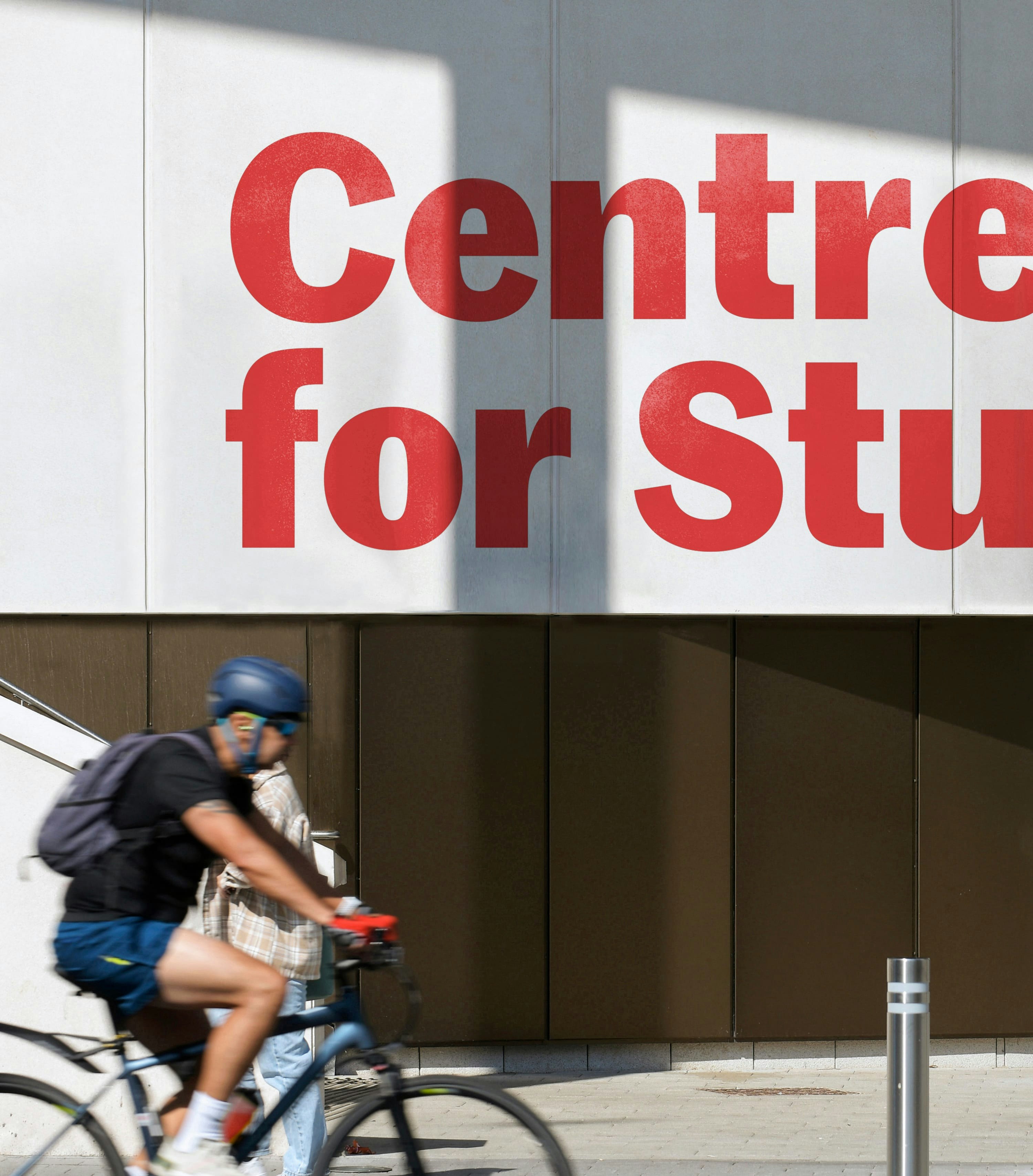
Over the course of the next year, we will be working closely with teams across the institution to embed the new brand, helping the University communicate both as a top-tier academic institution and an authentic and approachable community.
