The Brand Identity – Typography workshop interview
Published
17 February 2020

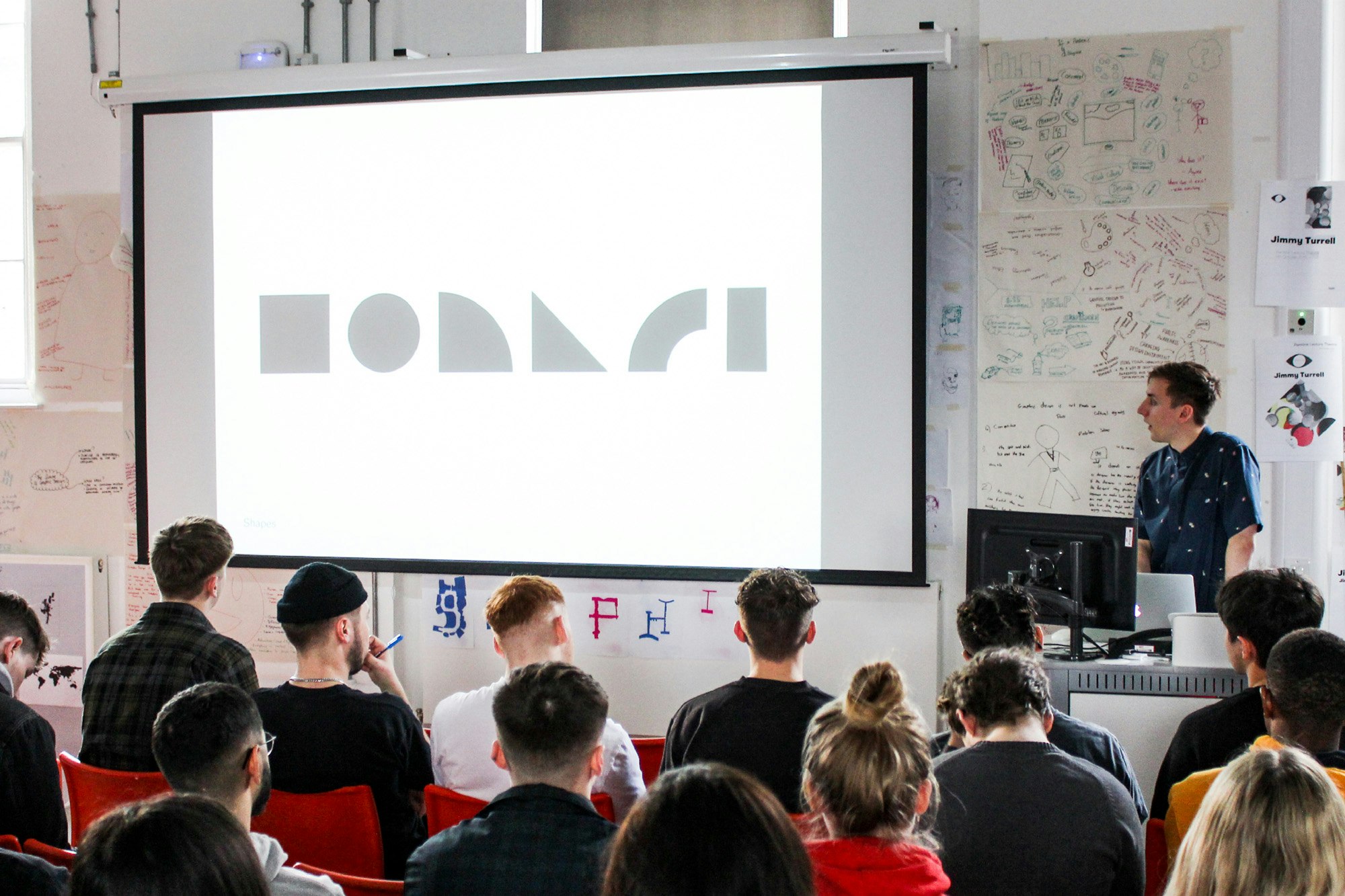
We recently spent three days with students from the Graphic Design course at Sheffield Hallam University, running a typography workshop that would challenge them to create their own modular typeface.
The outputs from the workshop caught the eye of The Brand Identity, who caught up with Matthew Tweddle, Creative Director and Daniel Reed, Senior Designer, to find out more about the work workshop. The full interview can be read over on The Brand Identity feed.

What was the idea behind the modular type workshop?
"An understanding of typography is central to all kinds of graphic design and logo creation. And type often plays a leading role in much of the work that we produce for our clients. We wanted to help students to develop the skills to be able to create their own fully functioning modular typeface. We have created bespoke typefaces for several of our clients and Daniel runs DR-Foundry. We knew we had the skills and experience to offer something of real value to the students."
How was the workshop structured over the course of the week?
"The workshop was split over three days, beginning with an introduction to modular letterforms, where they came from, how they are created, and their usage within brand identities for wider context.
We felt it was important to start work by hand so the students didn’t feel restricted by the computer, and we could encourage them to work fast and freely in an environment they could easily experiment within. The students were given a series of short exercises to form their own simple letterforms, using laser-cut shapes and gridded paper. We assigned everyone a single letter to create as many variations as they could until the end of the day. Students were told to experiment with shape, height, width and weight. We gave crits throughout the day and helped out wherever we could. It was great to see so much variety and individualism so early into the workshop.

On the second day, students were assigned a seven-letter word and told to take their favourite glyph experiments from the first day to develop in their word. The session helped students to understand how to maintain visual consistency through multiple letterforms, without overwhelming.
Once the students had developed multiple variations, we invited them to share their thoughts and processes with the rest of the group and begin to think about naming their typeface, taking influence from the visual personality of the forms.
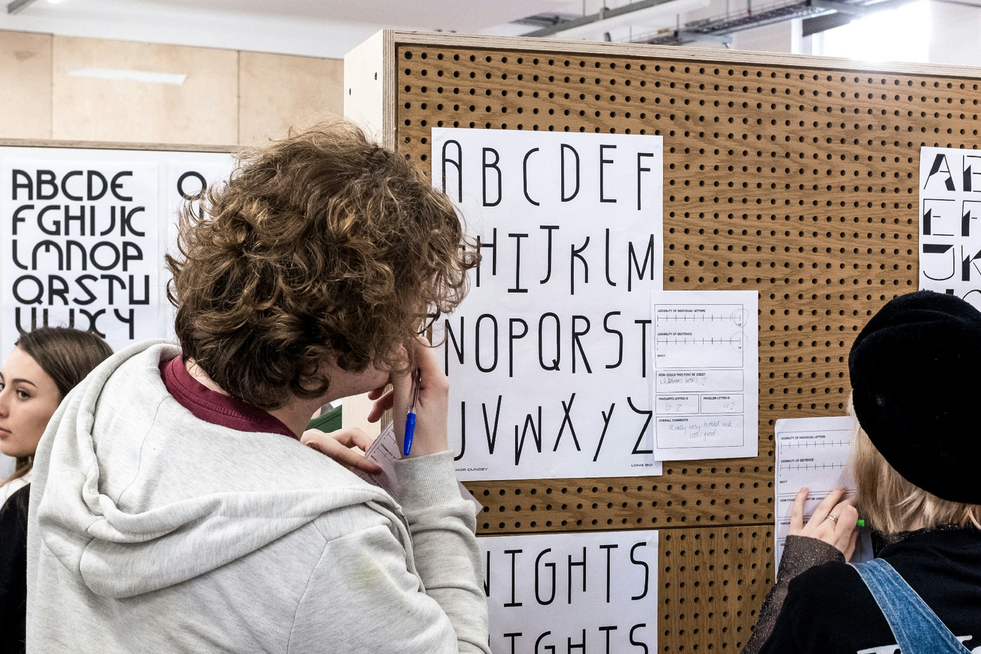
On the final day, the students were tasked with creating the remaining letters of their alphabet and invited to display their A-Z alongside a contextual poster that would include a short sentence expanding on the name of their typeface. Students were encouraged to be playful and to consider the use of language carefully.
The students took to this process really well, using humour, pop culture references and factual copy to make the most of their posters. We hung all the work in a pop-up exhibition which offered the students a chance to see what they had all created. The standard of work was very high and it was great to see their personalities come through so clearly.

Do you have any favourites?
"The standard across the board was really high, but we’ve included some of our favourites here. We particularly enjoyed Bianca Voicu’s (‘Groovinator’) experimental letterforms which capture a real sense of freedom and playfulness and demonstrate how creative and abstract you can be using just simple modular shapes. Sarah Graham (‘Bangers’) also created a fantastic modular typeface which looks like it would be at home on music records or posters. The fact that these typefaces were made in just a few days is really quite extraordinary!"
Head office22 Lever StManchester M1 1EA
Get in touchManchester+44(0)161 3992 607London+44(0)208 0500 223
Work with usFor new business enquiries,
contact Daniel Tweddle