Printworks brand now live
Published
17 January 2017

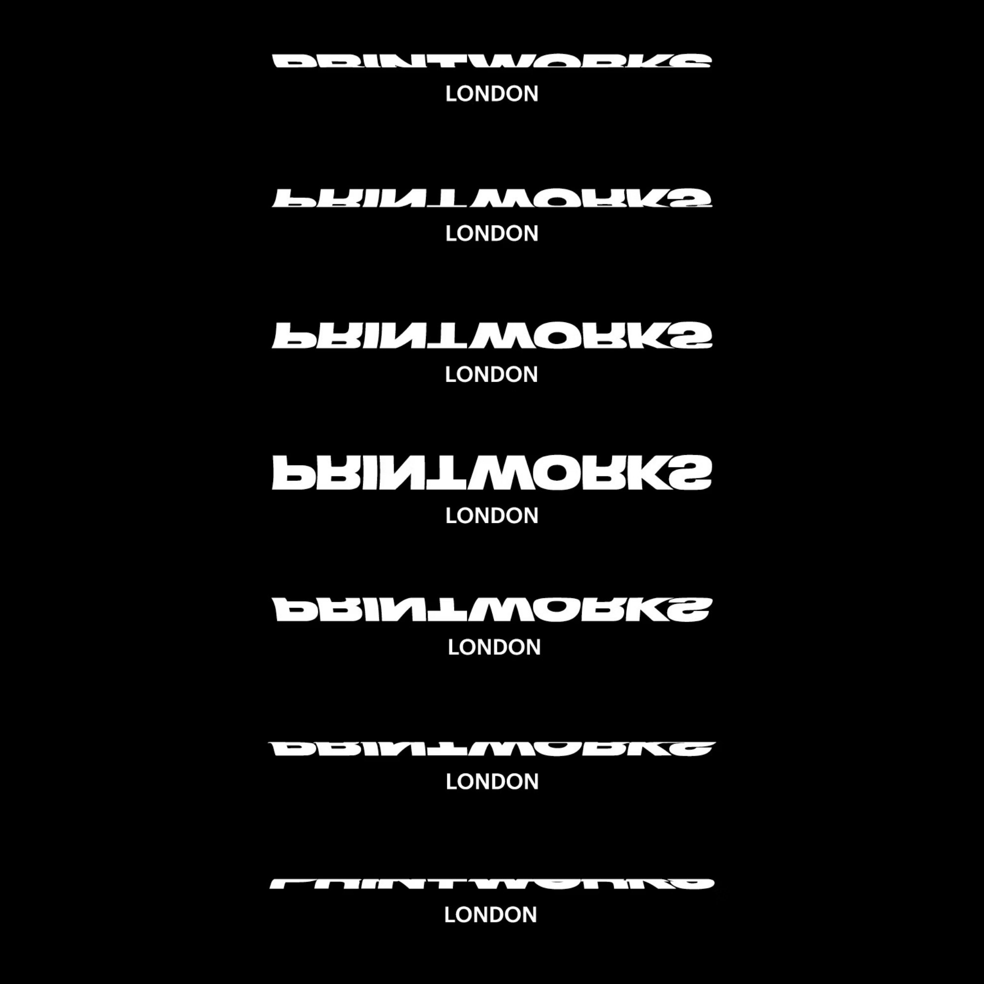
Over the course of the last few months we have been working to create a brand identity for Printworks London, a major new arts venue in Canada Water. Taking inspiration from the venue’s former purpose as the largest printing facility in Europe, the identity draws on reference from history to form a bold and adaptable visual identity.
A snapshot of the Printworks brand can be seen on our website. As part of the launch, our Creative Director Matthew Tweddle was interviewed by It’s Nice That. A snapshot of the interview can be read here:
What was the brief and what were you aiming for aesthetically?
We were approached to create a striking and compelling identity for a new venue seeking to change the face of London's cultural scene. The venue is set to host a broad range of unique events spanning the arts, film, media, fashion and music. The identity was to offer a flexible framework for promotion whilst capturing the history of the old printworks that was once the largest printing facility in the whole of Europe.
We looked to historic newspaper design and the attention-grabbing headlines deployed prominently and confidently across front pages. Visiting the site you get a real sense of the enormity and industry of the printing press and the techniques used in newspaper printing. In its day the press was rarely switched off and we wanted to capture that speed and constant movement by placing it at the heart of the identity.
What inspired the wordmark and logo? Is that a particular typeface or custom made?
The identity is all set in Commercial Type’s Druk. A study of extremes, Druk’s wide range of weights and styles afford broad communicative qualities, ideal for a venue hosting such an elective series of events. The huge rollers of the printing press informed the dynamic wordmark. By wrapping the type around cylinders we were able to generate infinite iterations of the logotype. The eleven chosen states were then redrawn and used indiscriminately across applications.
Tell me about the type for the rest of the identity - what were you going for?
Typographic expression is central to the visual identity. We wanted to allow for and encourage creative and confident typographic expression throughout the brand, with layouts derived from studying large printed newspaper sheets before they are cut and folded. We wanted to capture a snapshot of the process and embrace the mistakes and messy nature of the work.
How do you see it being applied in different formats and media?
Motion plays an important part in the identity. We’ve tried to capture that sense of movement in the printing process and this is reflected statically in print application as well as more dynamically in animations for online and social media.
Head office22 Lever StManchester M1 1EA
Get in touchManchester+44(0)161 3992 607London+44(0)208 0500 223
Work with usFor new business enquiries,
contact Daniel Tweddle