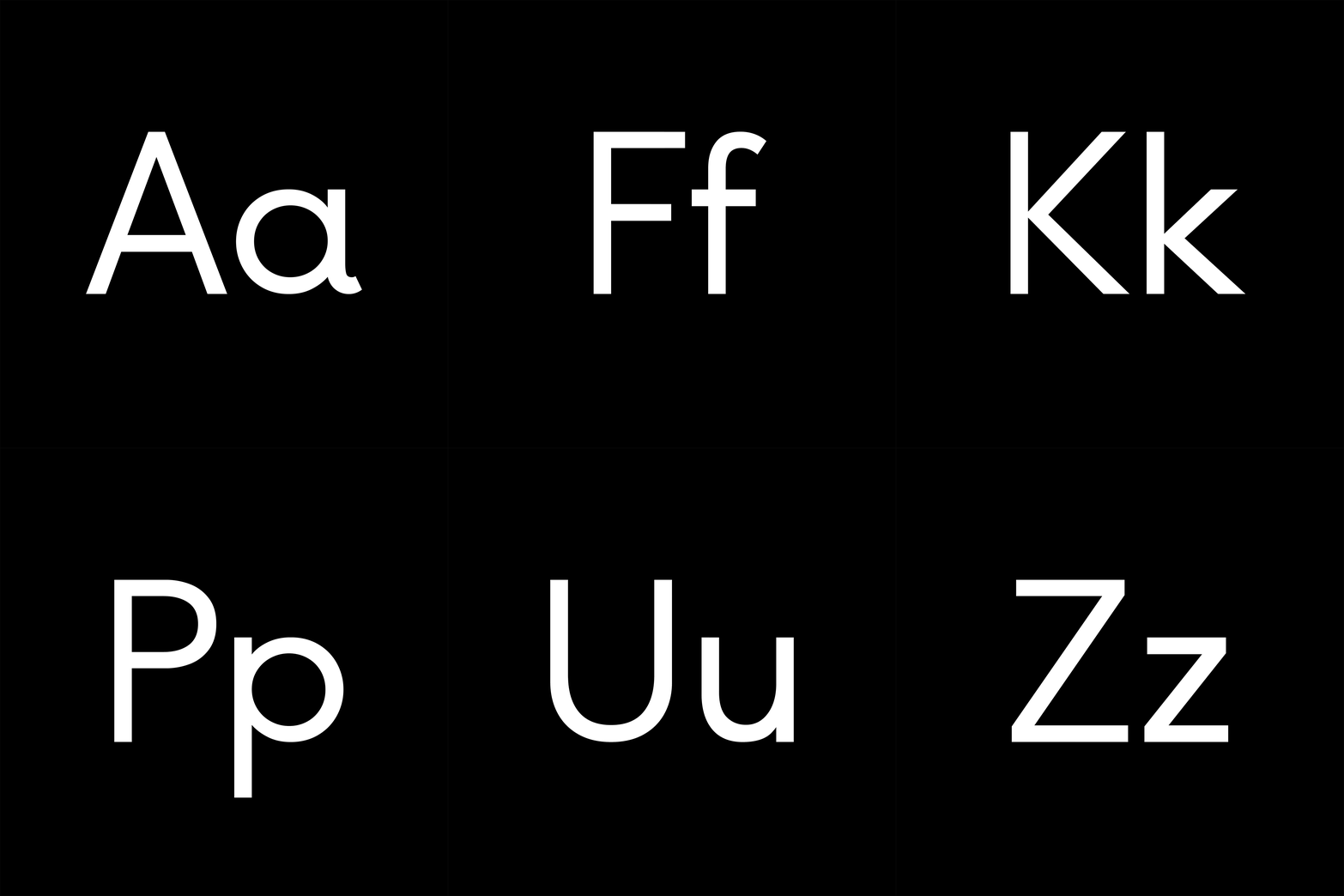
Only Buenos: a bespoke typeface for the Only brand
Published
18 September 2014

Branding your own studio can be a challenging brief. A few people have asked us about our process and the resulting Only logo.
From the outset we knew we needed a simple, timeless font with subtle character and personality. After months of trawling humanist and geometric sans-serifs, we finally settled on Buenos Aires by Swiss foundry Luzi Type. We loved how the open forms appeared throughout the character set, with playful moments lending the warmth we were after. But we were also keen to make a minor adjustment. In Buenos Aires the lowercase ‘L’ has a tail. Positioned alongside the ‘y’ the workmark felt too elaborate.
Luzi kindly recreated Buenos Aires as Only Buenos with the lowercase ‘L’ adjusted to have no tail. The end result is a harmonious balance of functionality and efficiency with unmistakable character — the playfulness of the ‘y’ balancing adjacent characters to soften the sentiment of the word.
Many thanks to all those who’ve commented on Only Buenos and to those who’ve shared our identity on their social channels. We really appreciate your support!
Head office22 Lever StManchester M1 1EA
Get in touchManchester+44(0)161 3992 607London+44(0)208 0500 223
Work with usFor new business enquiries,
contact Daniel Tweddle